Columns And Grid
Goal: Arrange several pieces of content side by side.
Time: 4 minutes
You need: A page, and three things worth showing together
Steps
- Select Add Block, then choose Columns.
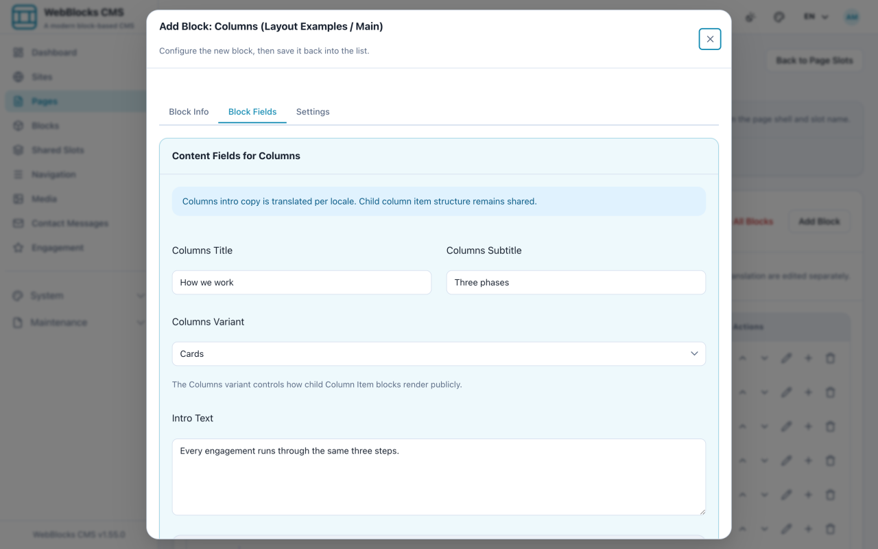
- Fill in Columns Title, Columns Subtitle, and Intro Text — Columns brings its own heading, which is what separates it from Grid.
- Pick a Columns Variant:
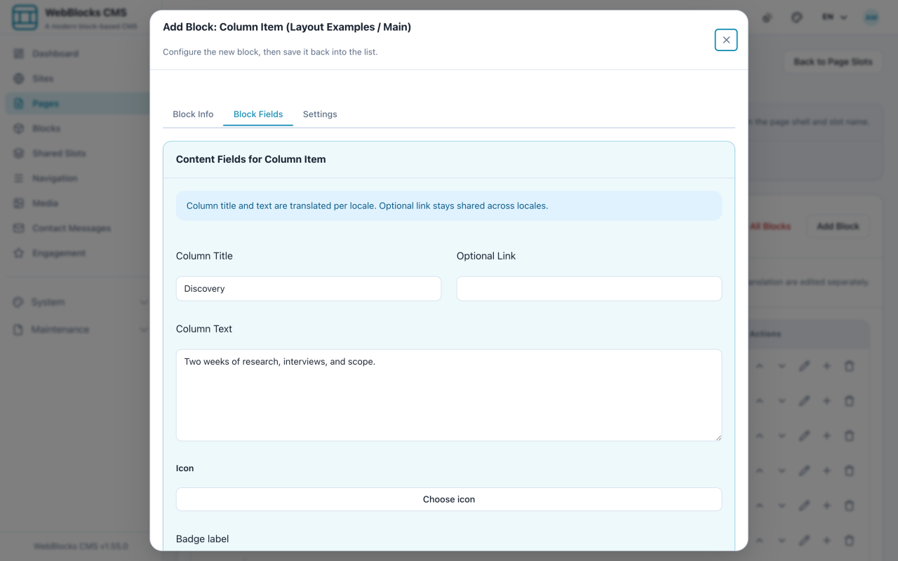
cardsframes each column,plainleaves them bare,statssuits short numbers. - On the Columns row, select Add child block and choose Column Item. Fill in Column Title and Column Text, and repeat for each column.
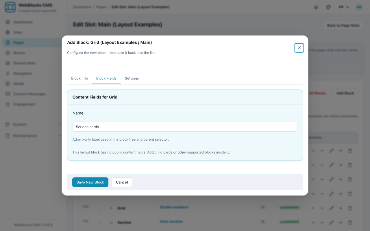
- For a bare arrangement, select Add Block and choose Grid instead. Set Columns (2, 3, or 4) and Gap.
- Add whatever you like as children of the Grid — Cards are the usual choice.
Columns Or Grid?
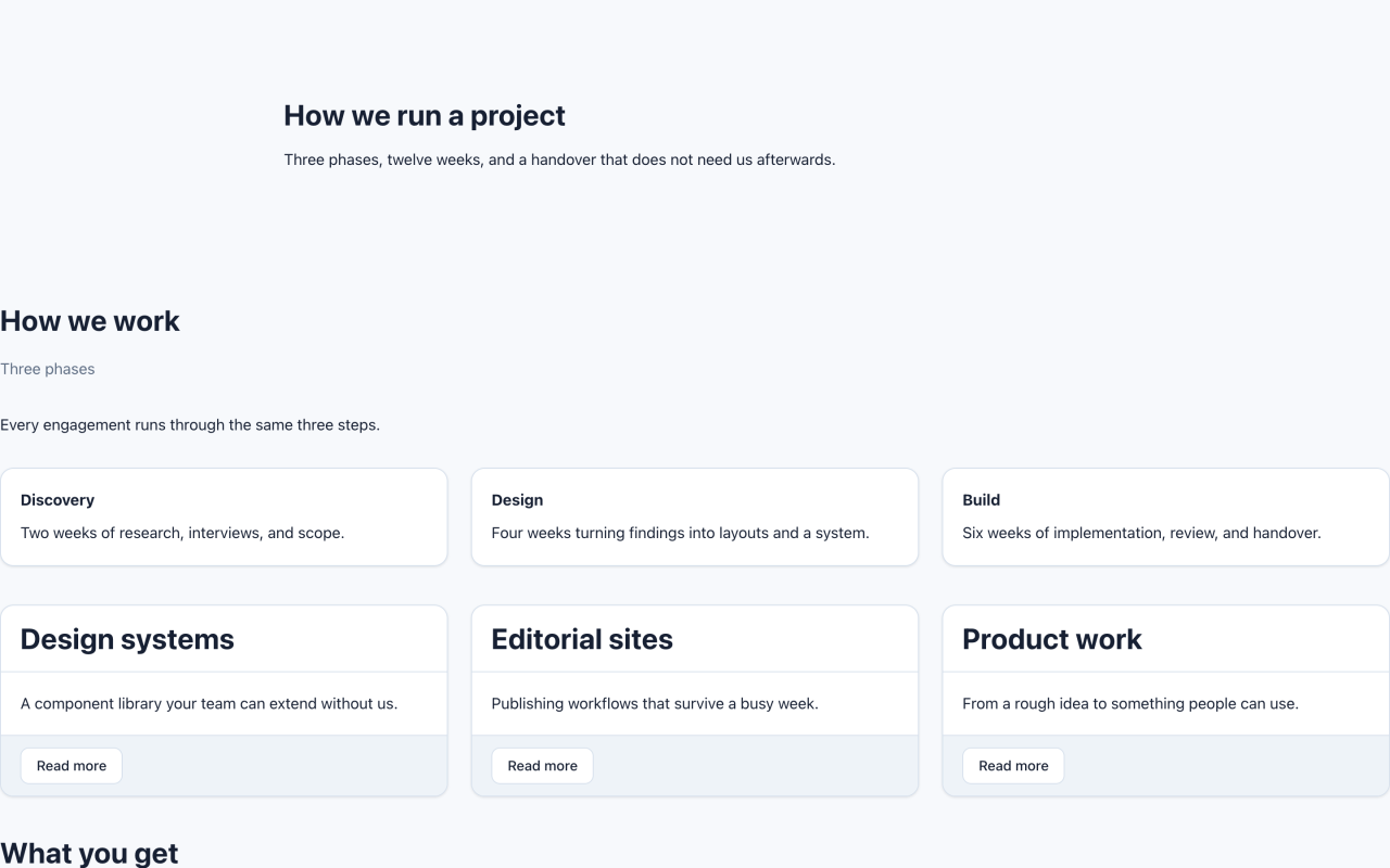
Columns is a content block. It has a title, a subtitle, an intro, and a fixed idea of what goes inside: Column Items.
Grid is a layout block. No copy of its own, no opinion about its children — just a number of columns and a gap.
Use Columns when the set needs an introduction. Use Grid when you are arranging blocks that already speak for themselves.
Notes
- Both collapse to a single column on a phone. That is the point, and it is why a table is the wrong tool for side-by-side layout.
- Four columns is usually two columns with extra steps. On a laptop each one is narrow; on a phone they are just a long list.
- Alternate media/text sections on Grid flips image and text sides down the page, for the classic alternating layout.
- Grid does not care what is inside it, so an accidental Grid of Headers renders exactly as badly as it sounds.