Card, Feature Grid, And Stat Card
Goal: Build a card properly, and know which of the three card-like blocks you actually want.
Time: 5 minutes
You need: A page, ideally with a Grid to put cards in
Steps
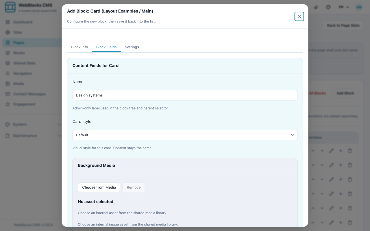
- Select Add Block, choose Card, give it a Name and a Card style.
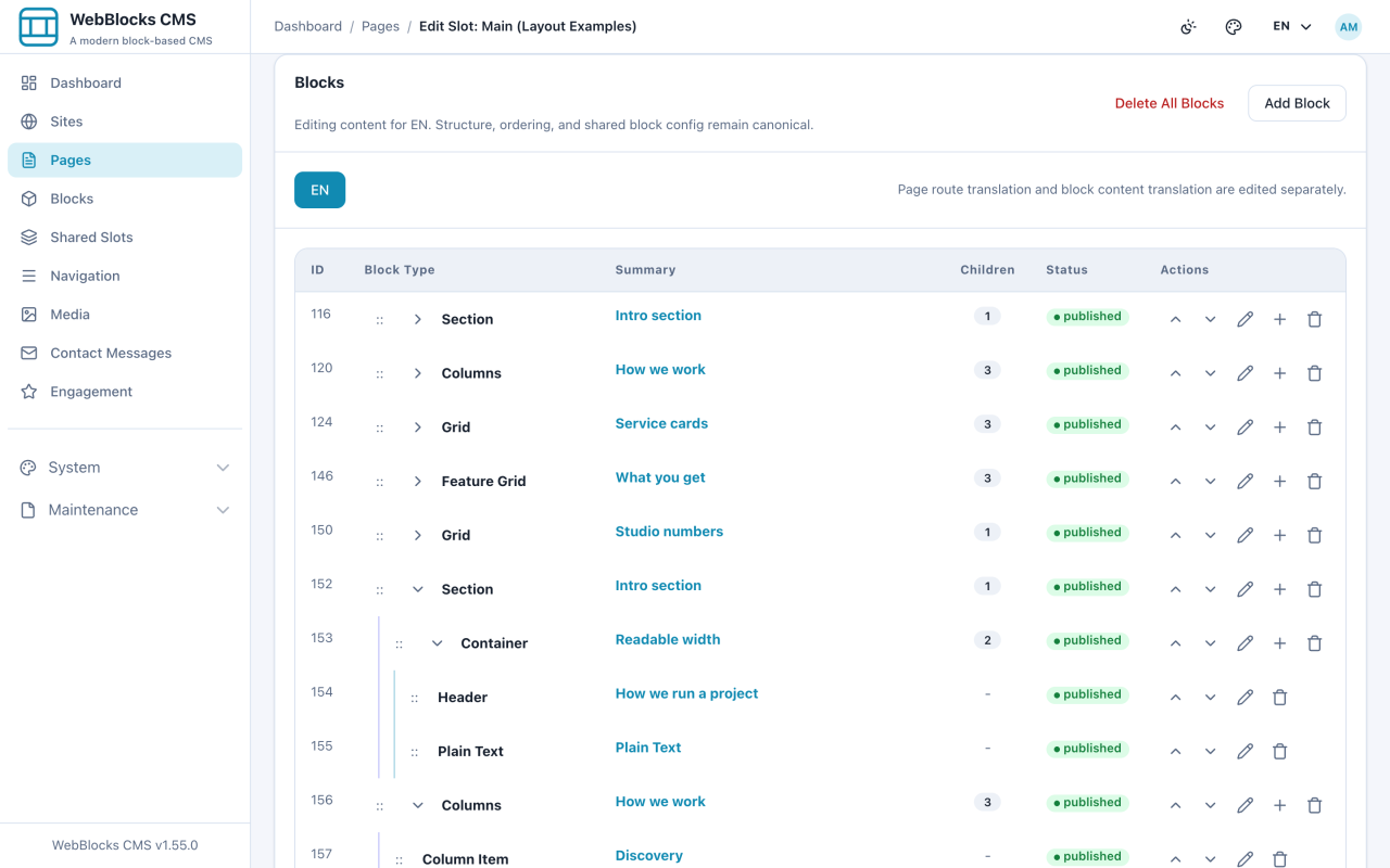
- A Card on its own renders nothing. On the Card's row, select Add child block and add Card Header, Card Body, and Card Footer. The regions have no fields of their own — they are containers.
- Add content inside each region: a Header in the header, a Plain Text in the body, a Button Link in the footer.
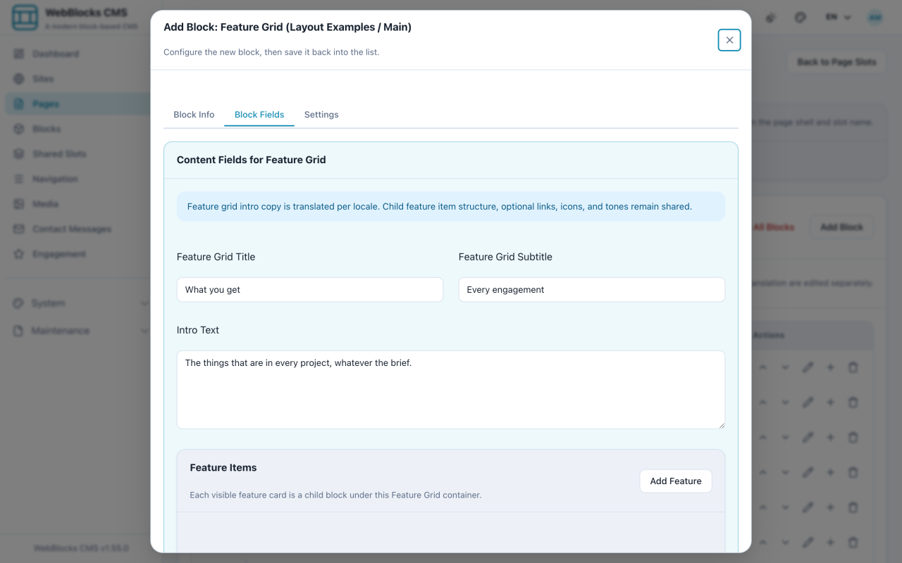
- For a set of short feature statements, select Add Block and choose Feature Grid, then add Feature Item children.
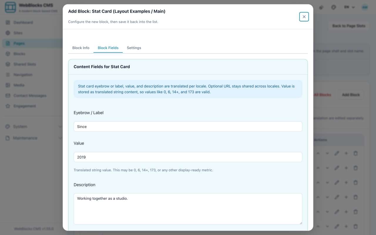
- For a number worth showing off, choose Stat Card: Value is the number, Eyebrow / Label the small line above it, Description the sentence under.
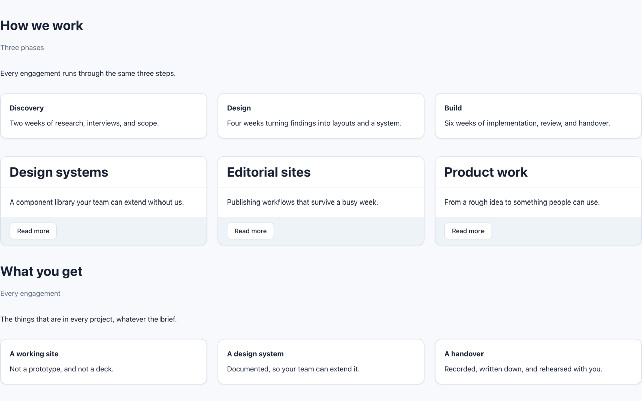
Which One?
- Card — the unit needs real content: a heading, a paragraph, an image, an action. You compose it.
- Feature Grid — three to six short "we do this" statements, uniform without composing each one.
- Stat Card — the content is a number. One value, one label, one sentence.
Notes
- Card regions are not offered in the top-level block picker. They only exist inside a Card, which is why Add child block on the Card row is the only way in.
- You do not need all three regions. A Card with only a body is fine; a Card with nothing is invisible.
- Cards inside Cards do not nest meaningfully. If you want a card grid, put Cards inside a Grid.
- Feature Grid is the quicker path and the less flexible one. When you start fighting it, you wanted Cards.
- Keep card copy at similar lengths. One card with three sentences next to two with five words looks broken even when it is not.
Make the whole Card clickable
<p>Set the Card link target when the whole surface should open one destination. The renderer keeps nested controls usable and avoids invalid nested links. Use a Button Link in the footer when the action needs its own label or when a Card contains more than one destination.</p>